OpenWrit
An intentional way to read the Bible. A quiet reading surface with the day's readings, highlights and the Catechism beside it.
Context
OpenWrit is an intentional way to read the Bible. I designed it, built it and launched it on my own, and it's the clearest example of the kind of software I want to make: useful, restrained and paced for attention rather than engagement.
Problem and opportunity
Most Bible apps are crowded. Plans, streaks, devotionals and notifications compete with the text, and reading becomes something you get through rather than something you sit with. [One sentence on what prompted the project.]
The opportunity was a reading surface that stays out of the way, with just enough structure to find your place and come back to it.
Solution
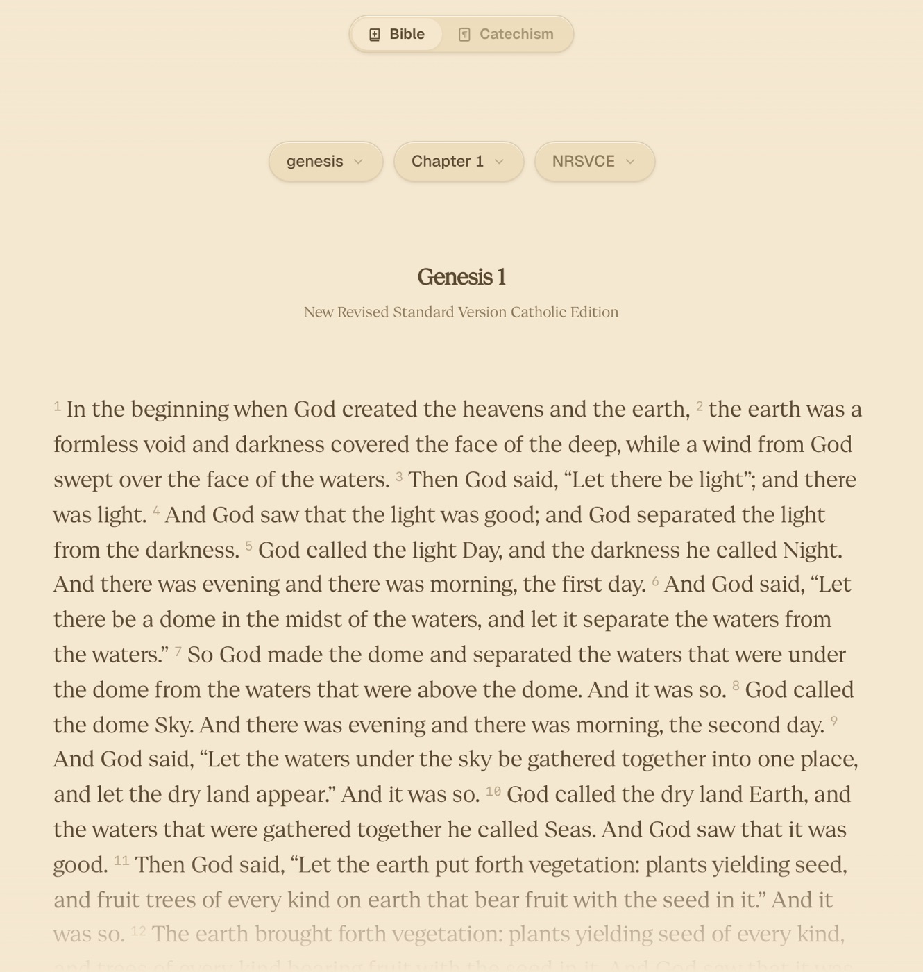
I started with the page itself. The type, measure and contrast are tuned for long reading, and the interface chrome recedes while you read. Navigation is fast enough that moving between books and chapters doesn't break the flow. [One sentence on how navigation works.]
Returning matters as much as reading. OpenWrit remembers where you were and puts you back there, so opening the app leads straight to the text. [One sentence on browsing or history.]
Daily readings
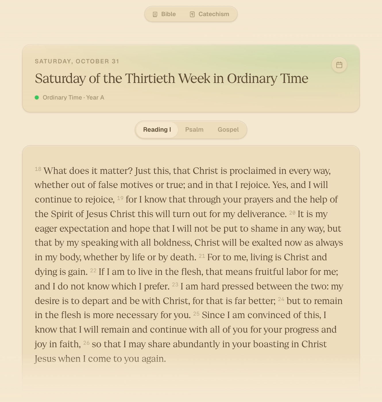
Each day opens on its Mass readings, under the date, the day's place in the liturgical year and its season. The first reading, the psalm and the gospel sit a tap apart.
The Catechism has a reader of its own beside the Bible, with the same type and the same pills, so moving between the two never changes how reading feels.
Details
The visual system is built on quiet contrast and generous rhythm. Most decisions were about what to leave out, and keeping the product from feeling empty once things were removed. [One or two details in Cade's words.]
I built the app and its release site myself, which kept design and implementation decisions in the same place. When spacing or a transition felt off, I could change it in the product, not in a mockup.
Where it stands
OpenWrit is live at openwrit.com. [One concrete detail: a reader's note, a number, or what's next.]