Notion Calendar is a powerful and delightful alternative to Google’s offering. Notion is known for its exceptional design team, a strength evident in both its core product and its upcoming mail client. However, Notion Calendar wasn’t built in-house, it was acquired through the purchase of Cron. Given that, I expected Notion to integrate Cron’s infrastructure into a calendar experience that felt native to Notion. Instead, they rebranded Cron and released it with a few additional features. The result is a fragmented design across Notion’s ecosystem, forcing users to adapt to an interface that feels disconnected from the experience they know and love. I set out to explore how Notion Calendar might feel if it looked more like… Notion.
My Role
UX Designer
Timeline
Spring 2025
Technologies
Figma
Result & Impact
Full redesign of Notion Calendar
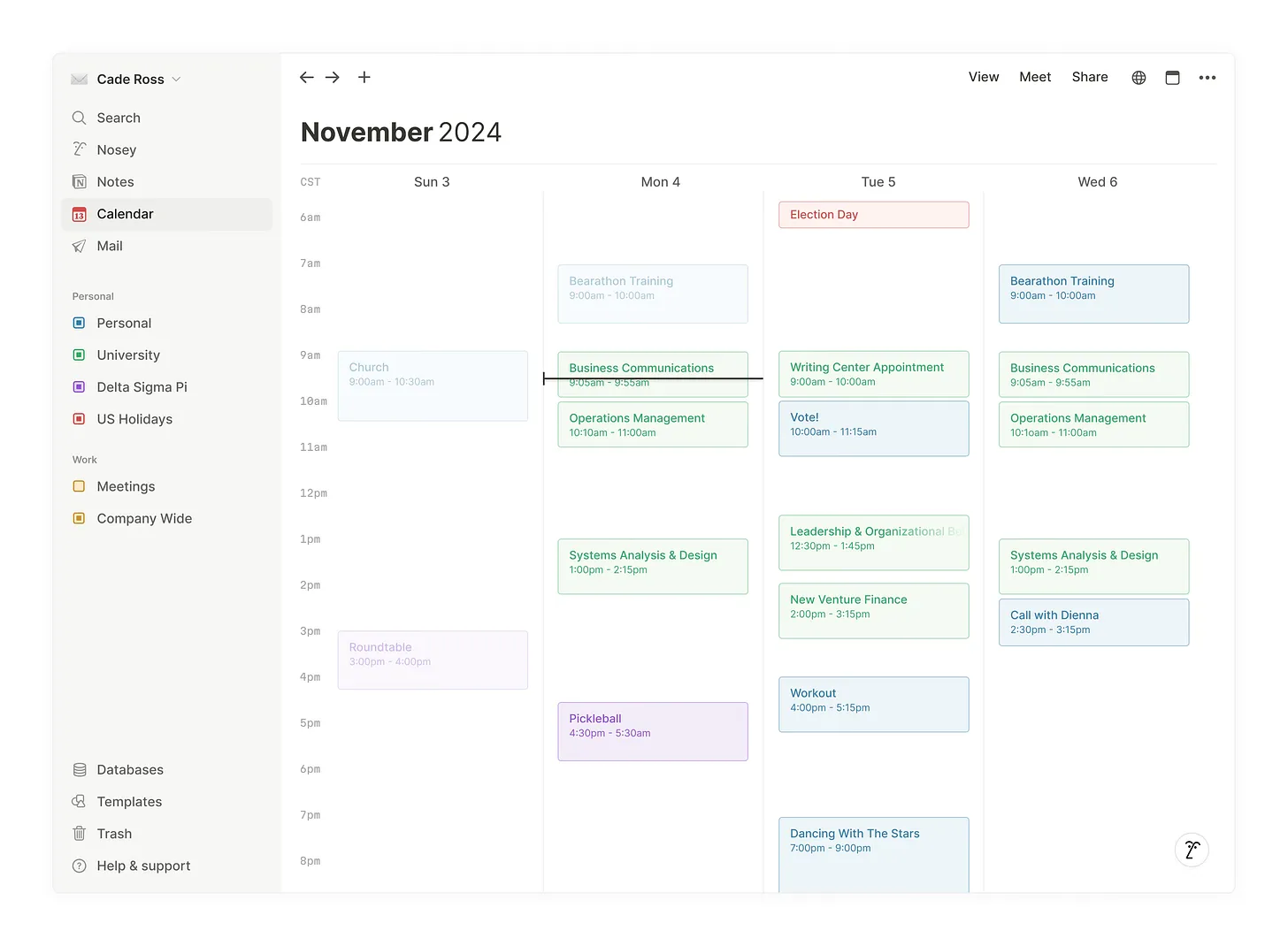
At the core of this redesign, my goal was to make every user feel at home while using Notion Calendar. In the new design above, the calendar view feels more in line with the rest of the Notion experience. I also made a few key updates to the sidebar—both to better support the calendar view and to create greater cohesion between Notes, Calendar, and Mail. Nosey (Notion AI) now has his own spot as well.
In my ideal future for Notion, all of their offerings would be accessible via one app, all by one click through the sidebar. This new sidebar design brings this into view.
Along with the updated sidebar, I have kept the familiar controls seen at the top of a traditional Notion window, just updated with calendar appropriate functionality instead of notes.
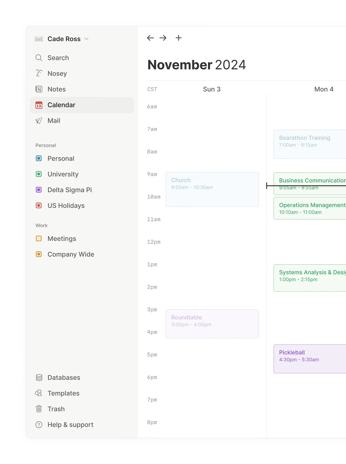
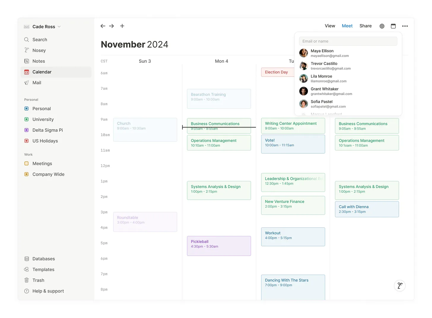
Notion Calendar includes a wonderful feature: the ability to quickly find a time to meet with your contacts. I’ve modeled this in the design below. A common theme throughout the redesign is that almost everything is accessible within one or two clicks, no more. Notion is fast, and Notion Calendar should feel just as seamless.
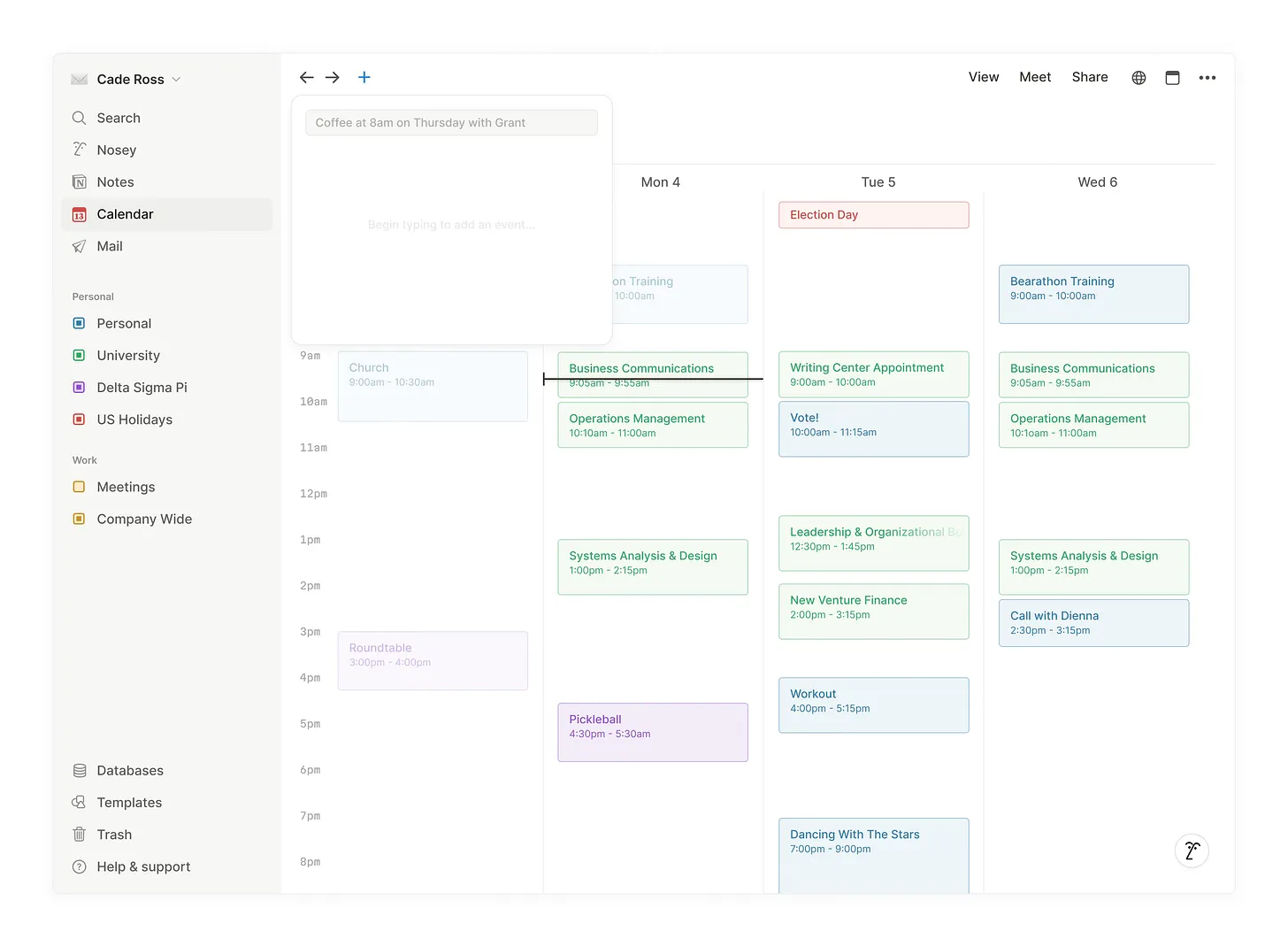
One of my favorite features in modern software is the ability to interact using natural language. I want Notion Calendar to fully embrace this by integrating with Nosey (Notion AI), allowing users to add events using the language and phrasing that feels most natural to them.
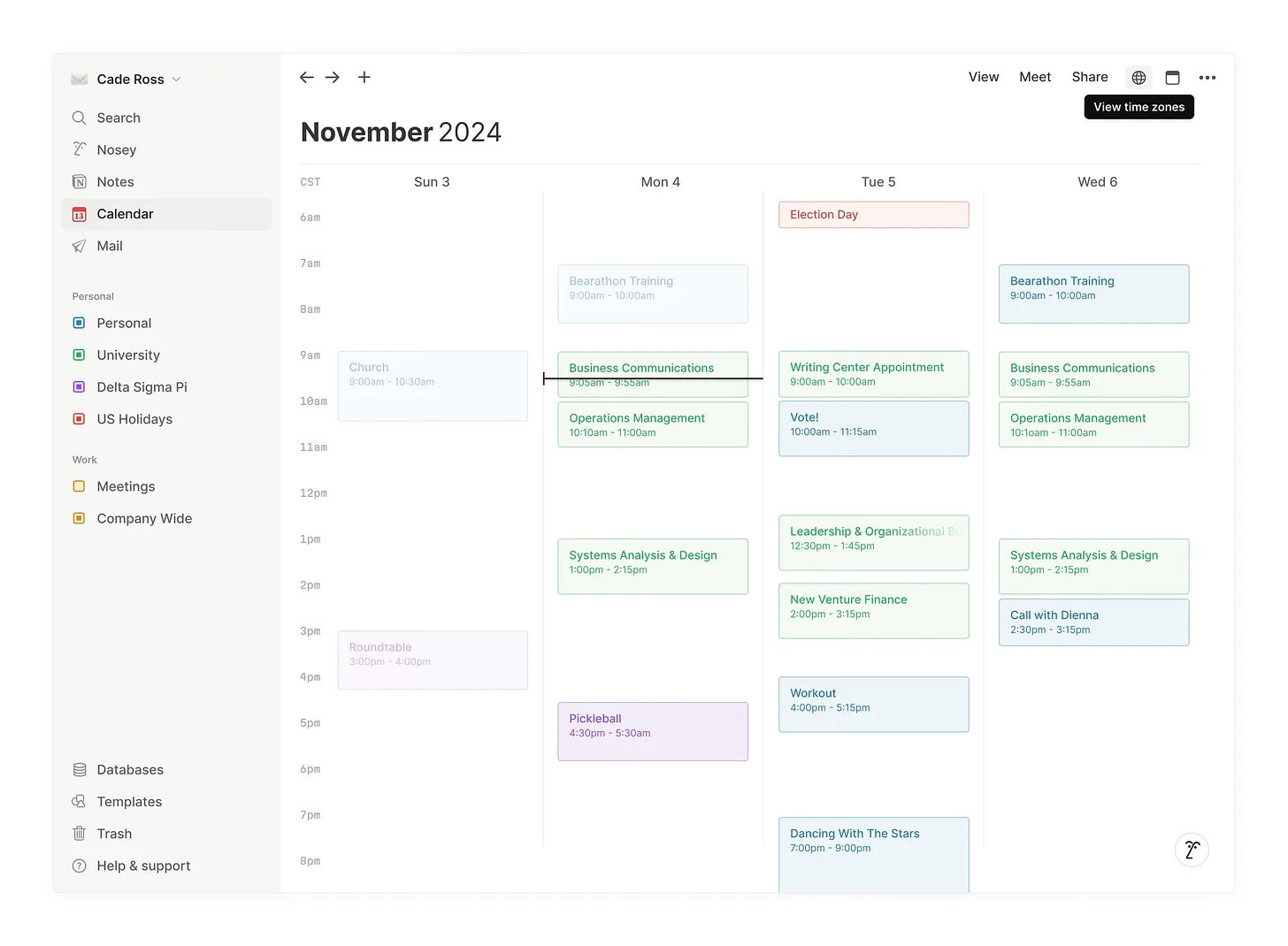
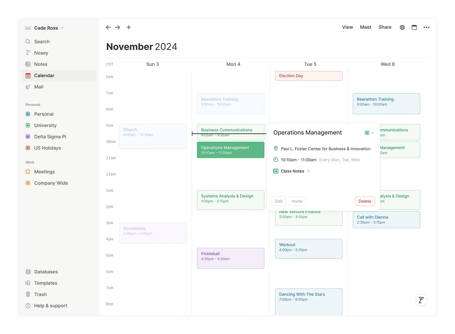
Instead of displaying event details in a right sidebar, as Notion Calendar currently does, I’ve opted for a smaller, windowed approach that gives the UI more depth and space to breathe. In the two images below, you can see the types of data that can be included within an event, not just the basics like location and time, but also linked Notion docs via the existing database integration. Integrating mail into events would also be a welcome addition, bridging notes, emails, and calendar items together in a cohesive way.
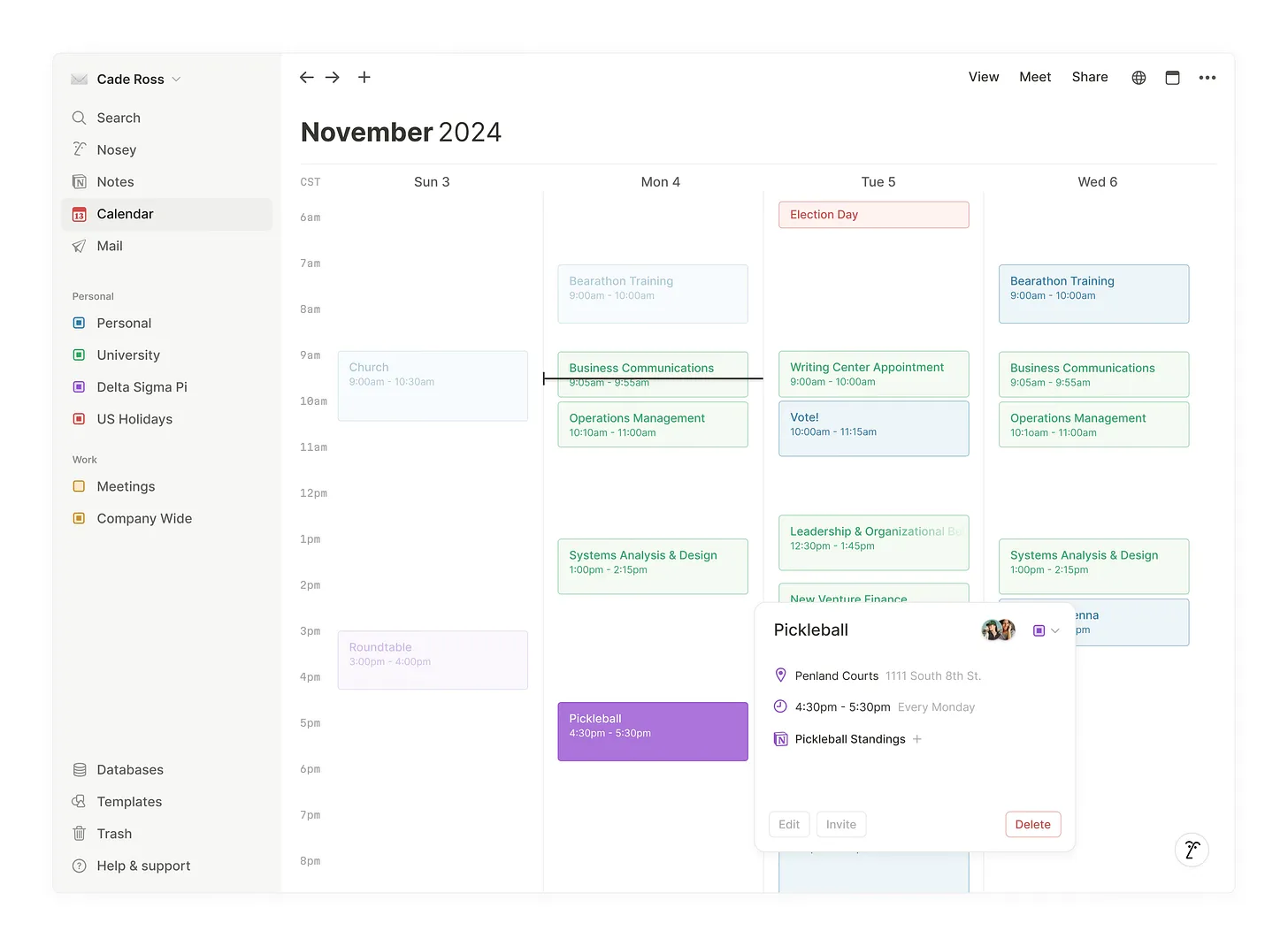
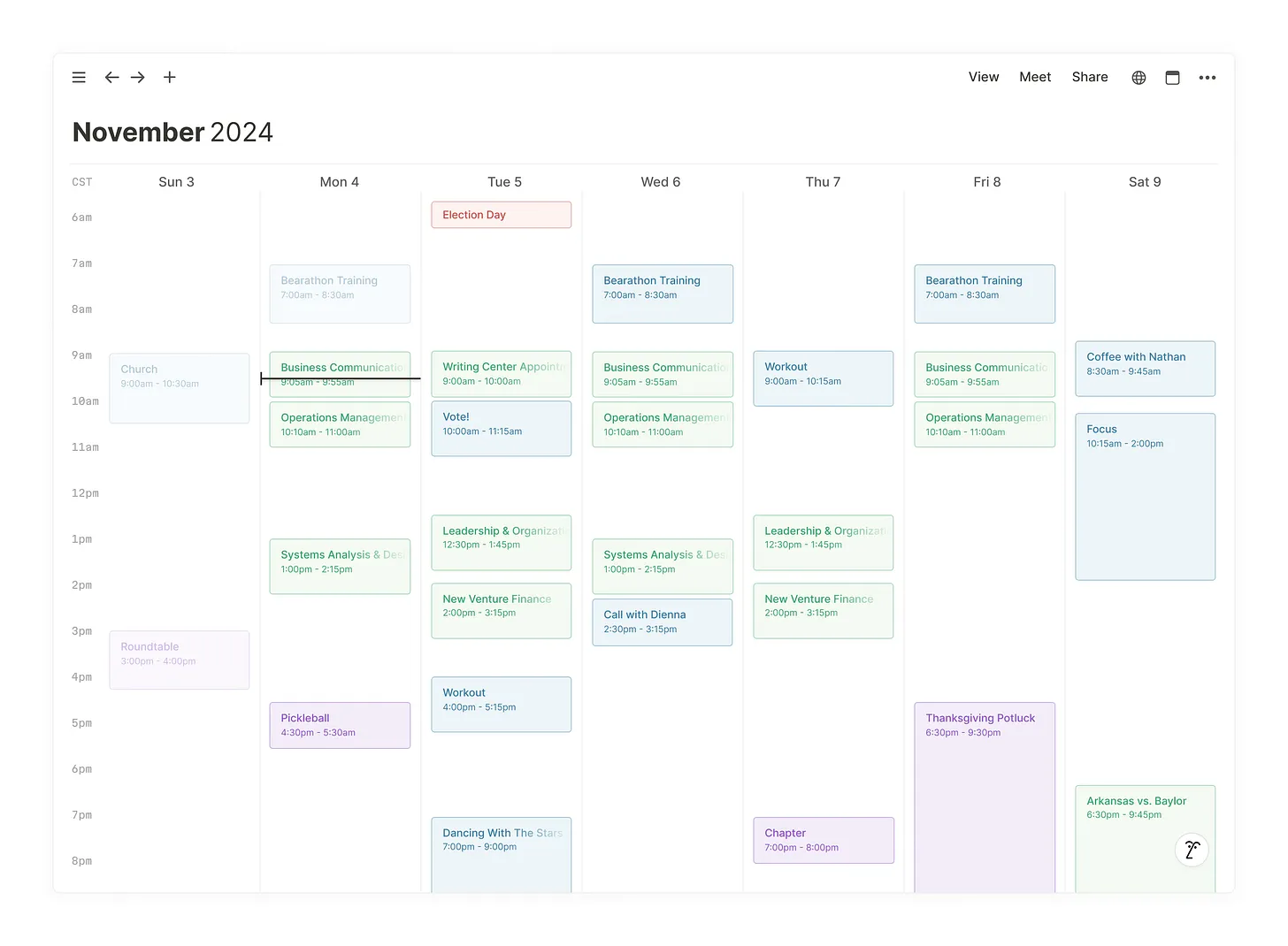
Lastly, each image above is shown in the 4-day view, which can be adjusted using the “View” button at the top of the screen. Below is a full-screen view displaying all seven days of the week. Your calendar is yours, it should reflect your preferences and how you like to view your time.
It was an absolute joy to explore and reimagine Notion Calendar. This was crafted in Figma, and you can view the file here. If you have any questions or want to get in touch, I’d love to talk! Feel free to email me.